Using data visualizations in your stories, can provide a more efficient and coherent way to present information to readers. Maps are one of the most popular ways to do this, especially when it comes to geographical data. Creating a map for your news story has never been easier. But how your map looks can be as important as the message you are trying to bring across.
We have some tips to make your journalistic map more exciting and unique, so that it will make your data, and news story, look unique.
Choose the right map
Choosing the right map is crucial. In a recent blog post, data journalist Maarten Lambrechts discussed how different types of maps fit different stories. Choosing the right map involves more than what kind of map to use (a locator map, choropleth map, etc). It also consists of the style of your map and the geographical layers you want to display. For example, showing mountain peaks or buildings can be distracting but, of course, it all depends on the story you are telling.
Don’t stuff your map with information
When building your map, avoid any information that is not relevant to your story. The more precise your map is, the easier it will be to read.
Take a minute to think about scale and details
Building up from the previous two points, you need to be mindful of the scale of your map. If the scale is right, your map will be clear and understandable within a second. Depending on the map, being too far out of the location you want to show can be detrimental to your story. The same applies to the opposite.
It is essential to also consider that the closer you are to a specific location, more information will be available to you (road names, city names, neighborhood, parks, et cetera). However, a packed map can be distracting, and you might end up scaring your reader away.
Within Map4News, you can control this by activating or deactivating the specific layers you want to show. This way, it is in your hands what you show regardless of how close you are to a location.
Don’t be afraid of colors
When visualizing your data, do not be afraid of colors. Especially when using choropleth maps, colors can be your ally. But, using colors can be tricky. Watch out that the map doesn’t get too colorful as it can get messy. Also, always try to stay within the same color scheme; this will be more pleasant to the eye. You also have to take into consideration that some colors have explicit and implicit meanings. For example, if you are making a map about the US election results, it is essential to know that red stands for the Republican Party and blue for the Democratic Party.Use icons
Using relevant icons in your map can help your readers understand it faster while keeping it stylish and exciting. For example, when creating a plane route with a curved line, adding a plane icon will instantly explain the route, without the need of many words.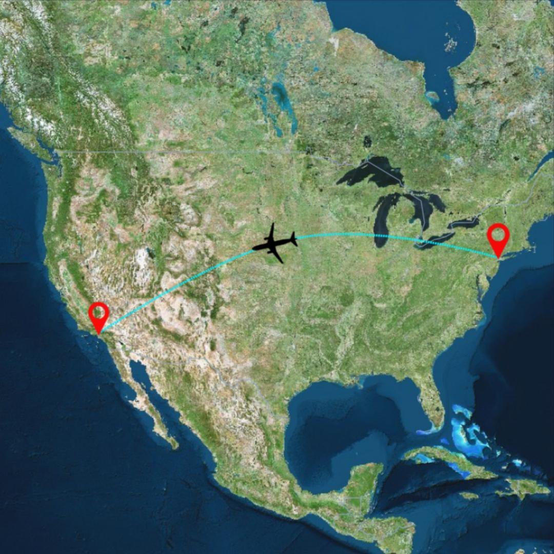
Include pictures and interactive media
One of the many advantages of digital maps is their ability to host audiovisual media. So, if relevant to your story, do not restrain from embedding pictures or videos in your map. It will make your map more interesting and attractive. If you decide not to use any audiovisual media in your map, you can still use your creativity to create a dynamic map based on your data.Have a completely personalized and unique style
The best way to make your map stand out from the pack is to have a unique style, with personalized layout, icons, fonts, and colors. Doing this on your own requires knowledge on programming and graphic design. It can also take a considerable amount of time; time that might need to work on your story. But with Maps4News’ access to your own signature map styles, it’s easy and fast. Just sign up and get in touch with one of our agents to see what Maps4News can do for your newsroom or company.


