Deck the story with interactive elements
Fa-la-la-la-la, la-la-la-la
‘Tis the season to create maps and visualizations
Fa-la-la-la-la, la-la-la-la
Okay, so it doesn’t quite capture the spirit of the original verse, but it does underline how we feel about maps and visualizations. Yes, we are crazy about them. Nothing says, “great storytelling” like a dynamic map with interactive elements, right? Well, we hear ya! At Maps4News we understand that one of the best ways to turn a good reader experience into a great reader experience is the addition of a well-conceived and well executed map – oh, the miracle of mapping!
In this season of goodwill to all cartographers, we also know that there are those less convinced by the ability of a good visualization to truly bring a story to life. Bah humbug! So, as a gift to you, we have turned to some of our media and publishing partners across the world to spread the word about why visualizations are so important to their content and audiences, what works and what doesn’t, and which tips they’d offer to you for creating great story-enhancing visuals.
Why bother with maps and visualizations at all?
According to Phil Holm, assignment editor, interactive at Associated Press (AP) in New York, maps are ‘essential to storytelling’ and ‘sometimes visualizations are the story.’ During the recent U.S. hurricane season the AP’s impressive online Hurricane Tracker received over 2 million views, the majority of which were from mobile devices (55.1%) – helping readers to access and digest vital information via a fully interactive map.
Creating an interactive element like this, says Phil, increases the average time a reader spends on a page – commonly referred to as the ‘dwell-time’ – and often acts as a ‘hook’ into other relevant content such as charts, video, text stories etc. In the example of the hurricane tracker, the average engagement time per visitor is 2 minutes and 18 seconds – impressive!
"Sometimes visualizations are the story"Phil Holm, assignment editor, interactive at AP
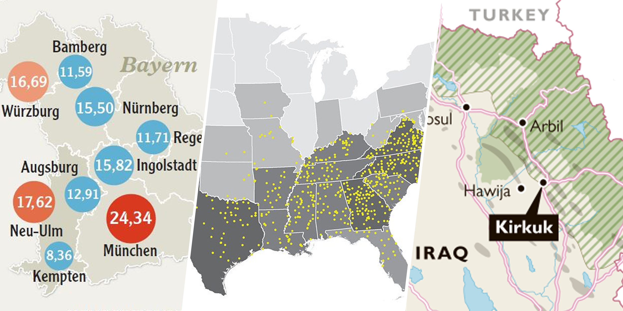 Visualizations using maps & location data can help to enrich your stories.
Do it right from the get-go!
For Sam Joiner, interactive news editor at The Times in London, ‘it is important to select the right visualization for the story you’ve got.’ Using the right visualization will add context to the story and will help readers to engage more deeply. During the 2017 UK general election, 60% of visitors to The Times’ website who landed on a page with an interactive element, engaged with it.
Sam and his team at The Times work hard to ensure that the interactive elements within an online story are as easy to access as possible, as this results in higher engagement rates. With the trend towards mobile, online readers tend to ‘scroll’ not ‘click’, so it’s advisable, suggests Sam, to avoid hiding important information behind unnecessary additional interactions such as a click or tab. Page design/layout is central to the success of your visualization, so take time to make sure that it sits naturally within your piece, ensuring that it is given the appropriate prominence to allow your readers to easily delve deeper and to become fully immersed in your story.
"It is important to select the right visualization for the story you’ve got."Sam Joiner, interactive news editor at The Times
Personalization, Personalization, Personalization
If you really want to impress with visualizations, then personalization could be the answer. At The Times, a reader may initially engage with a national headline, and then embark on an online content journey that will enable them to ‘search for their local story’. For example, a story about the national general election results may transition neatly to the highly personalized ‘Best Places to Live’ feature. With the enticing headline of ‘find your best place to live’ and an array of beautiful location photographs and stylised button and slider filters, it presents Times readers with a selection of suggested areas to live from across the UK based on their purchase/rental preferences. For a deeper delve, there is the irresistible and fun 11-question, multiple-choice quiz with such questions as, ‘who is your ideal neighbour’ and ‘what is your ideal Sunday?’ – all leading to an even more personalized location recommendation (in case you were wondering, Edinburgh was my top recommended location).
Yes, but will visualizations feature in the future of content?
In his Newsroom Life Q&A for the Maps4News blog, Steve Bernard, interactive design editor at the Financial Times stated that, ‘I see data vis as becoming ever more important to the newsroom, a good visualization can invariably tell the story in a clearer way than words could ever do.’ Ah yes, but that’s just one opinion, right? Well, true, but we also asked Christian Imminger, art director at Augsburger Allgemeine for his thoughts on the future of visualizations and he said that its ‘importance will increase because we are going not only into a digital but visual era and the practice of our readers/users is changing.’ Christian’s top tips for creating great visualizations… ‘be clear, puristic – and also clever.’
"We are going not only into a digital but visual era and the practice of our readers/users is changing."Christian Imminger, art director at Augsburger Allgemeine
What have maps and visualizations ever done for us?
It is hard not to draw a parallel with the famous scene from Monty Python’s Life of Brian, but let’s be honest, maps and visualizations play an important role in storytelling and together with our media and publishing partners, we believe that they will continue to be a vital ingredient in providing an unparalleled reader experience in the future.
So, what have maps and visualizations ever done for us? Here is a short summary of the themes from this post – maps and visualizations will help you to:
- Enhance the story and reader experience
- Increase dwell-time and act as a ‘hook’ to other content
- Provide context and improve engagement
- Enable a highly personalized and unique experience
- Create valuable interactive content in an increasingly visual era
Let's talk about maps! Don’t hesitate to reach out to [email protected] or on Twitter via @maps4news.


