Using visuals in your story keeps the reader’s attention. It can show the basics of the story in just seconds and make the story much more attractive. Also, when writing about data, visualizing can make it instantly more interesting and easier to understand. Sometimes you don’t ‘just’ want to add an image to your story. Sometimes you have pictures, numbers and a map and want to use them all together. Now, if you are a skilled photoshopper, this should be no problem. However, if you aren’t, don’t worry! There are loads of (free) tools that can help visualize your story.
Charts and graphs
Numbers; we hate them but we need them. They can add necessary information to our stories but just aren’t sexy. Use too much numbers in your story and people will get distracted. Luckily, there are some ways to make them more interesting. Graphs and charts perhaps don’t immediately sound as number’s much hotter sisters, but make no mistake! People like looking at images and that’s what graphs and charts are! Besides that they look good, they are also super clear and can immediately show numbers in comparison.
Maps
When you think of maps, words that might cross your mind are: conceptual and abstract. Not really exciting stuff. Yet, where applied properly, a map instantly clarifies a lot of things. It draws the immediate attention of the reader. Actually, research (Griffin & Stevenson, 1994) suggests that, when trying to tell a geographic story, greatest efficiency is achieved by a combination of text and maps. Besides the instant draw of attention, a map also carries a great part of the story. The reader immediately knows where the event is happening and the map gives an early impression of the content. A map can give more life to an event. By using a legend, you can already tell small parts of the story. It illustrates the story in a comp letely different way than a picture, with much more information. For example: you’re writing an article about the Tour de France. You can just tell the reader about the route and where the cyclists are at the moment. You add a picture of the cyclists and you’re done. But with a map you can show the story. You can show where they are, where they’ve been and where on the maps big moments happen(ed). A map can just make the story more lively.
Infographics
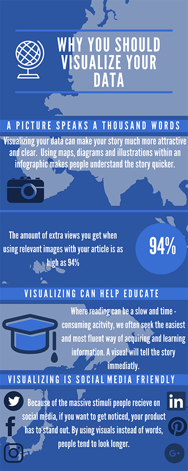
Infographics are popular. Besides being attractive they are very easy to understand. People understand images faster. Why try to describe a pencil, if you could just show an image of a pencil? You can tell an entire story in one infographic. Infographics are also perfect to share on social media. In just a few seconds, people already know the basics of what your story is about. Put an infographic together with some charts and maybe a map and you have an amazing, visualized story.
- So, there you have it! Of course you can add a lot more features to your story and visualize a lot of different ways. Did you visualize a story perfectly? Or do you have good suggestions on how to visualize your story? Don’t hesitate to reach out to [email protected]


