For the Locator Map you have the possibility to download an SVG which will be responsive on any device you wish. This is also the first requirement: your CMS needs to support this file type for the responsiveness to work.
The second requirement is to choose the responsive size in the first step. If you don’t have that size in your settings, please contact our support team.
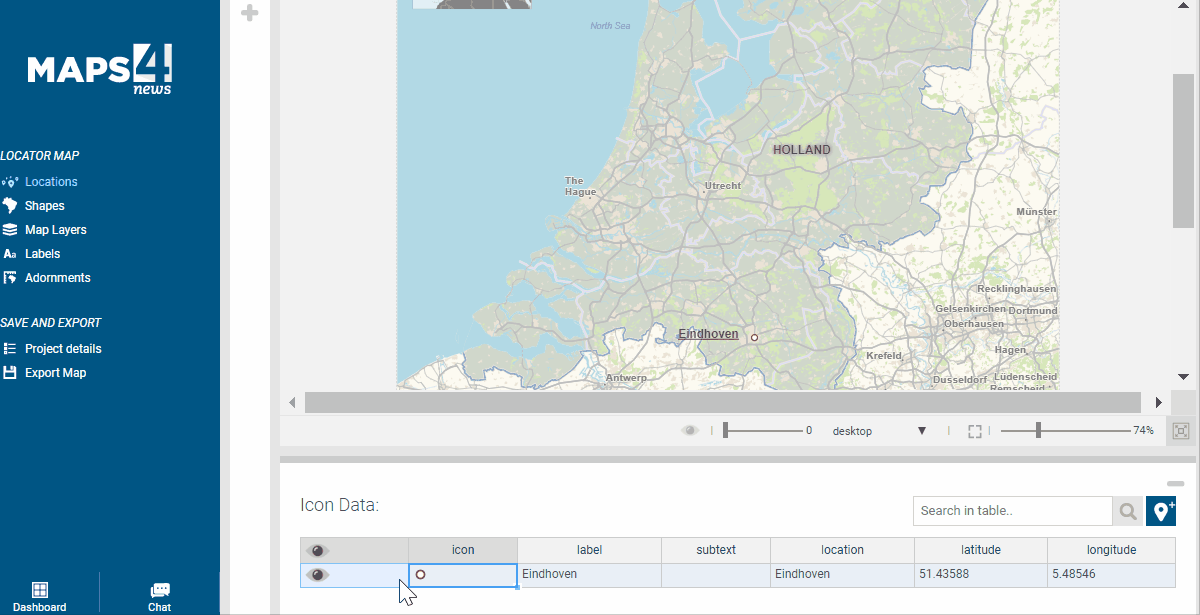
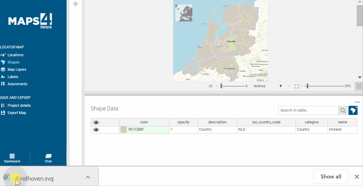
Wait for the first calculation to be completed and you’ll see that you have limited options for resizing the map inside the tool. However, you’ll see a dropdown with Desktop/Tablet/Mobile, which gives you a preview of how the map is going to look there. To define these sizes to your liking, you can send our support team the specs of each device.
The rest of the steps to style your map remain the same: you can remove labels, rename them, add or remove shapes and disable layers.
Afterwards, click on Export and choose the SVG type.
To try out how the map responds, you can simply resize the browser window and it should give you a nice insight how it’s going to look like at the reader’s end.
Key features of each device:
Desktop: shows all standard elements
Tablet: less labels, bigger font size
Mobile: no inset map, less labels, bigger font size